I redesigned and rethought the SF Garden Club website. I was the Product Designer of a small team of 4 incredible designers: Lila, Mari, Lewis, and Laura. I managed the team, and I was actively part of the UX/UI Design process and Web Design. I designed the personas, competitive analysis, site map, user scenarios, task flow, and high fidelity Mockup. We used WordPress and Elementors to have more flexibility in our design. I worked on the project for six months, and I am now in charge and responsible for any changes working directly with the stakeholder.
San Francisco Garden Club
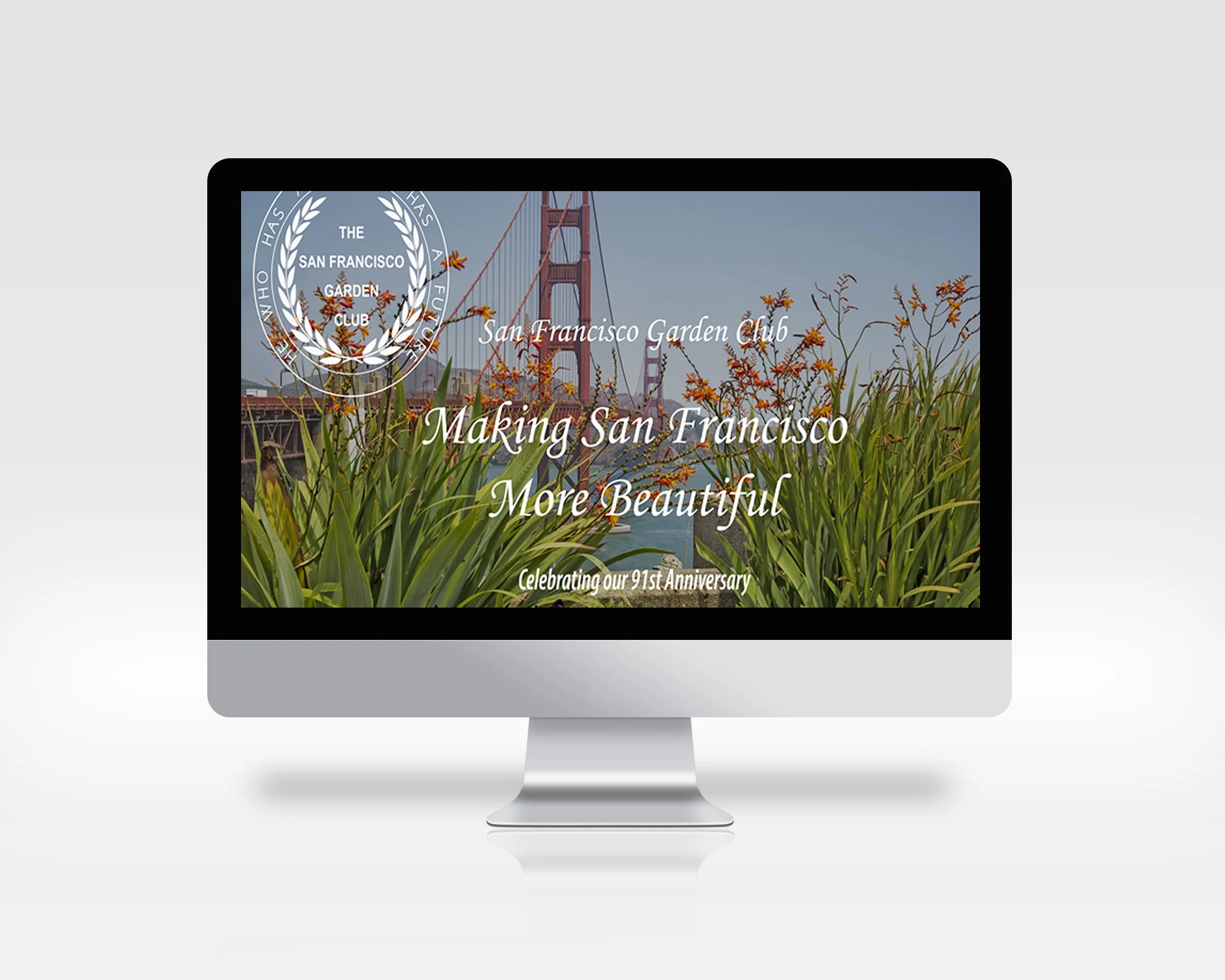
Before
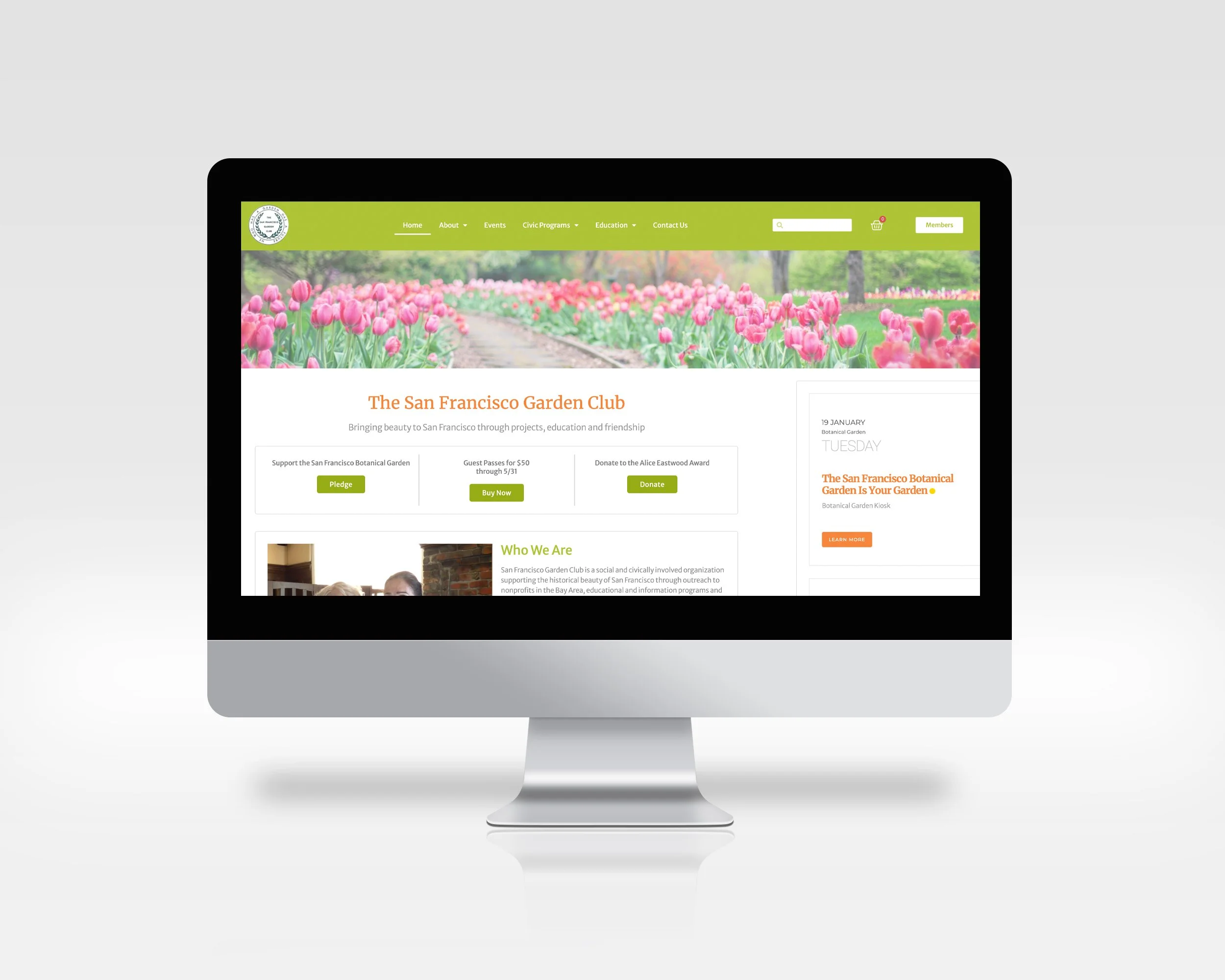
After
Problem Statement
What problem are we trying to solve?
How do we know this is a real problem?
Why is it important to solve?
Who are our users? What are their goals and motivations?
How will we know if we’ve solved the problem?
San Francisco Garden Club is a social and civically involved organization supporting the historical beauty of San Francisco through outreach to nonprofits in the Bay Area, educational and information programs and scholarships, and physical participation in gardening and civic projects that restore and preserve the beauty of San Francisco.
They needed to create a website where new users could join the club, show the upcoming events, have a reserved area for the members-only, access the board members and newsletters, and increase the donations to inform the users about the diversity of their programs and projects.
Unfortunately, the website needed to be improved in some aspects. The website was built more than ten years ago, and for this reason, the usability, readability, and hierarchy were significantly compromised. We started to understand the stakeholder's business goals and how much the user's needs were changed.
Research
We did some research, and we found two primary users' group: the current members of the SF Garde Club and the new user that may join the club.
Persona One
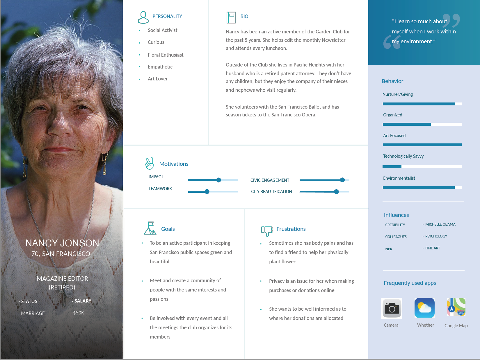
Mari passed a store window that reminded her of the De Young exhibit "Bouquets to Art." She'd checked it out the month before with another member of the garden club. She was on her way to meet a friend for coffee and pulled out her phone. "I wonder when the next floral arrangement workshop is." On the SF Garden Club's homepage was a calendar of events. Different types of events had other icons next to them (*just an idea to use icons). Seeing a workshop two weeks in the future, Mari tapped the event name. She was forwarded to a page with a photograph of a flower arrangement and some info about the event. She then selected "register for event," and a prompt appeared asking for her membership login (*not sure if non-members can register but pay extra, some clubs allow this). Having filled that out, she landed on the registration page, which luckily was simple, and accepted Paypal. The payment was refundable if the cancellation happened a week in advance (*they might need a week's warning if they offer food to people and materials for the workshop?) She'd opted to receive her payment receipt via text, which showed up on her phone right as she arrived at the coffee shop.
Functions involved:
calendar with listings that can be selected to view further information
if only members can register for events: login prompt, that then forwards the member to a payment page
if anyone can register: payment page with an option to not log in, but pay more as a non-member, or log in as a member and pay the membership rate
after payment, some kind of receipt or verification send to phone or email
possibly an option to receive a text or email reminder about the event a couple of days before the date
User Scenario
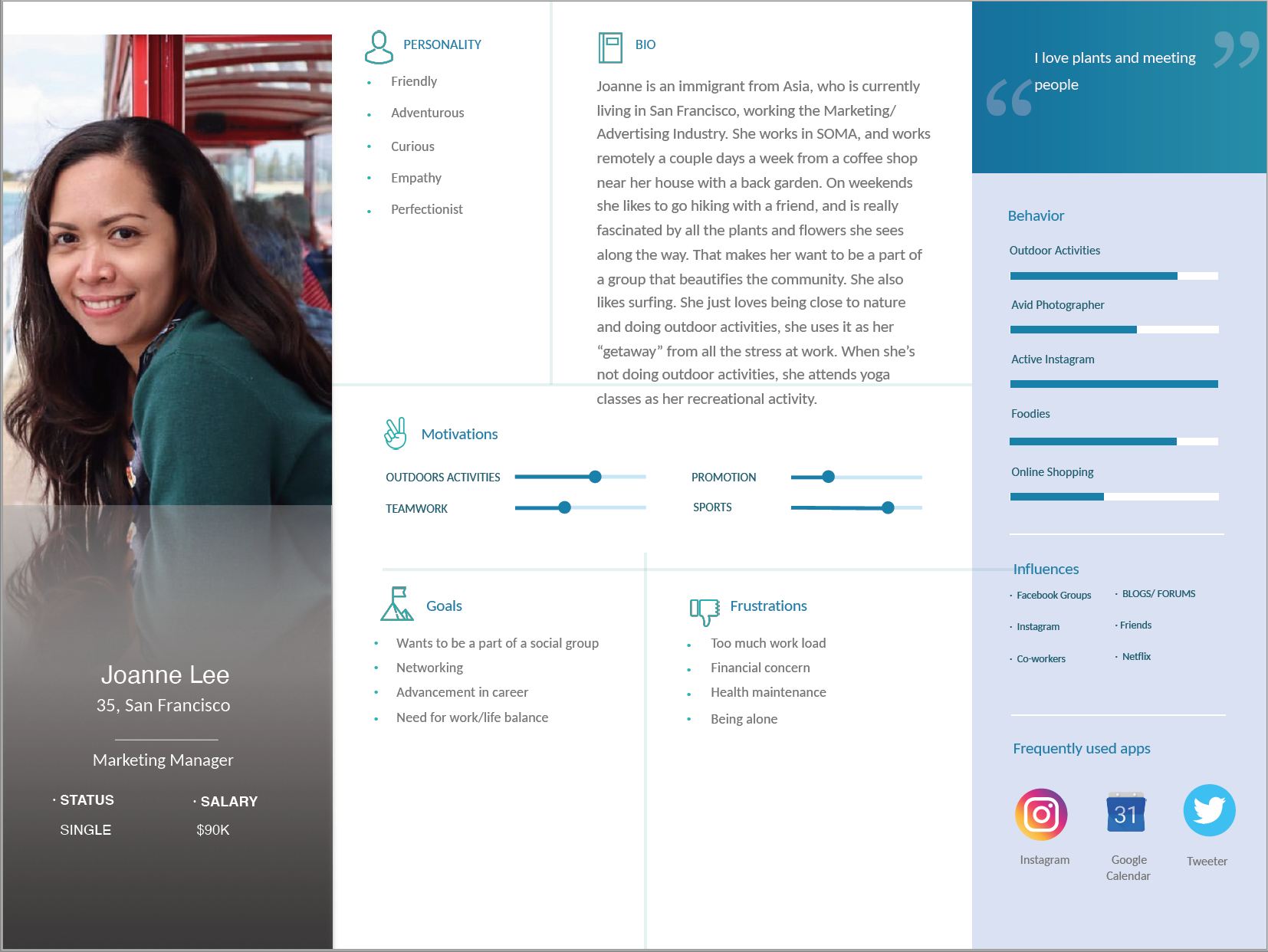
Persona Two
Step 1. After attending a banquet, Joanne is interested in joining the club
Step 2. She goes into SF Garden club website
• will she know the URL or use a search engine?
Step 3. She navigates through the website looking to get more information for becoming a member.
• will she find this information quickly?
• we will have to provide easy navigation for club information
• we may have to put a link to the of this quick info at the sign-up page
Step 4. She goes into the sign-up section and provides her information
• we may want to show a timeline of the actions of the sign-up
Step 5. She pays her dues and now a member
• we will have to provide costs, membership confirmation, and possibly donation separately
User Scenario
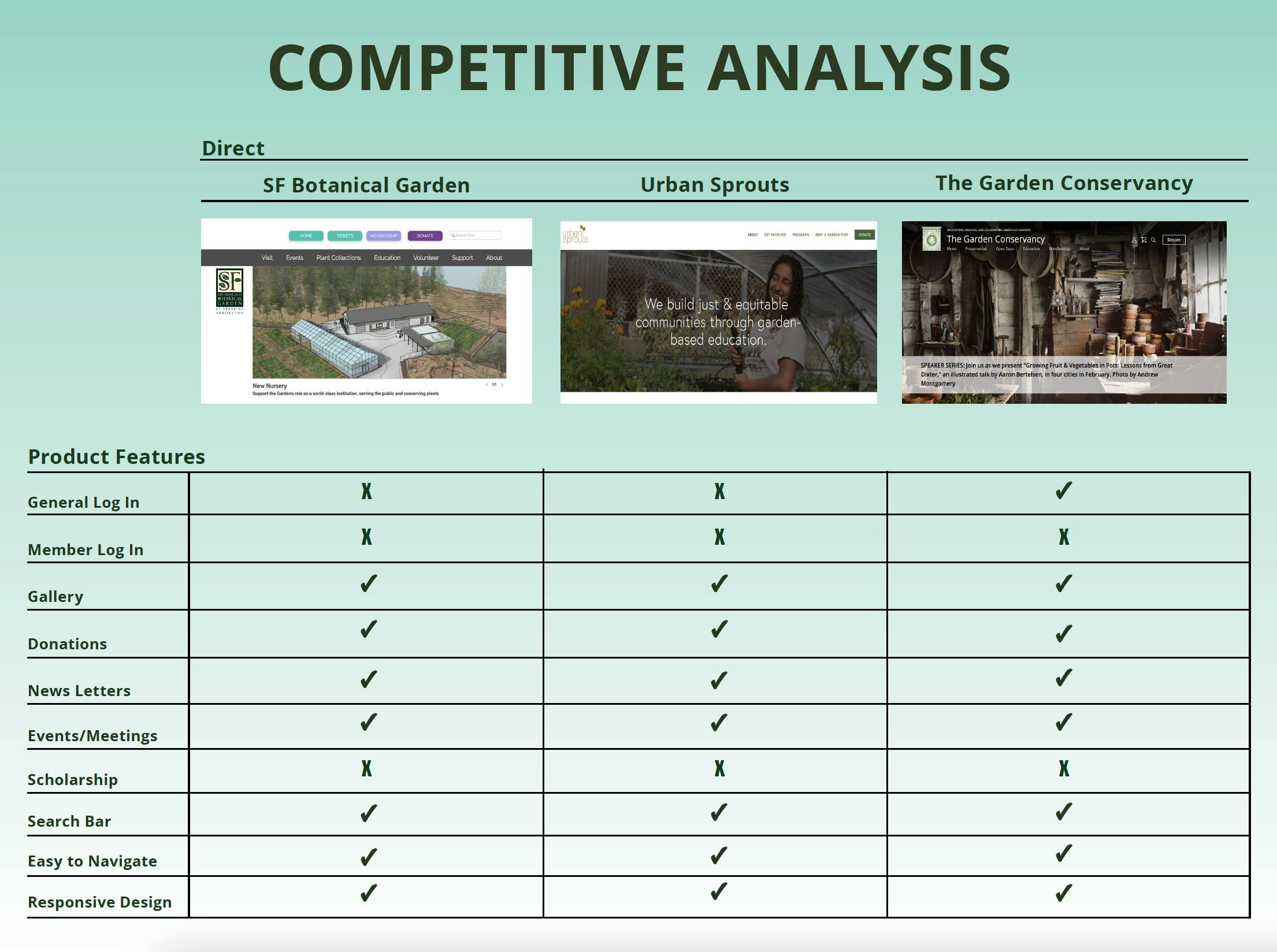
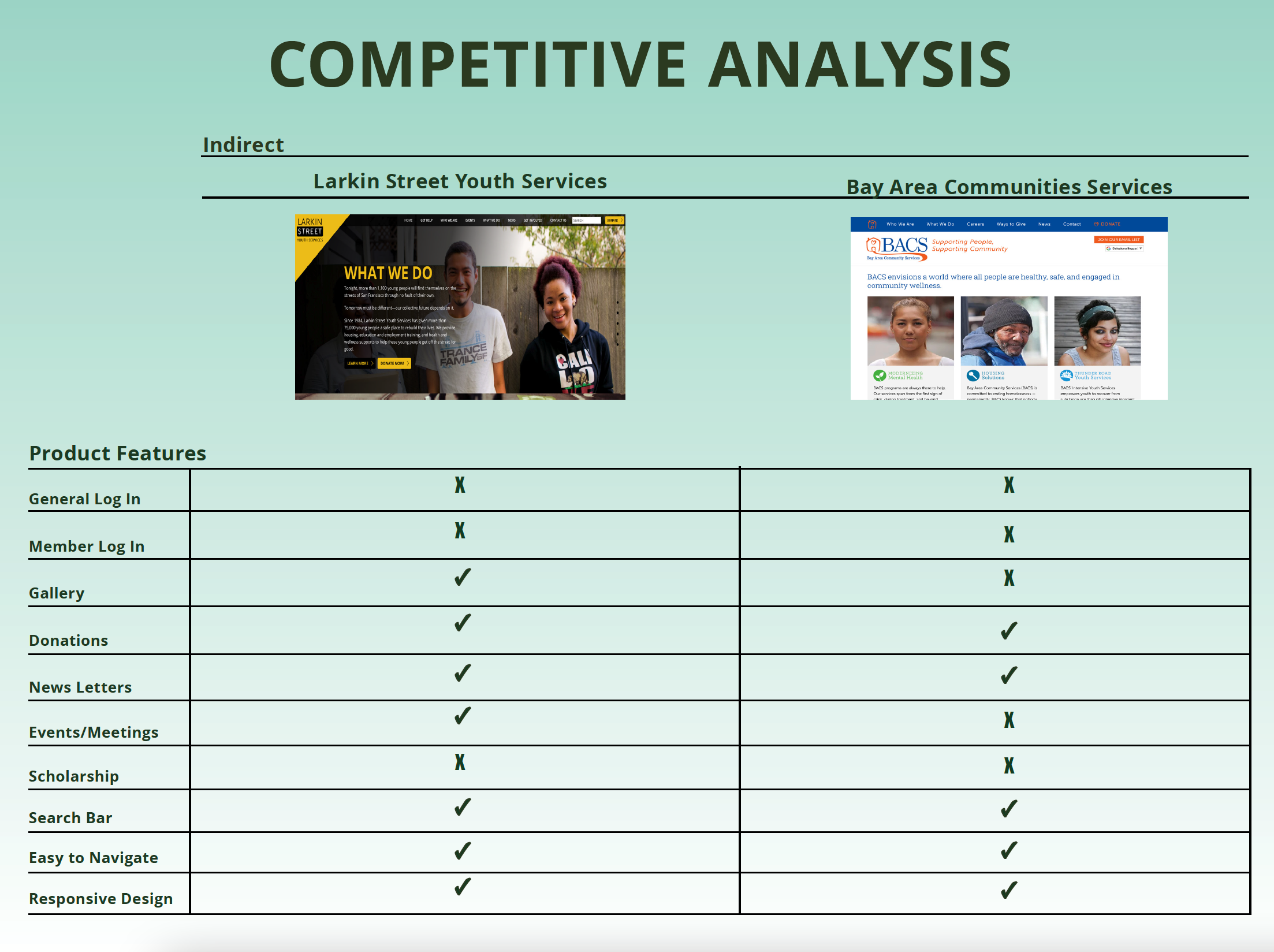
Competitive Analysis
Based on our Competitive Analysis Landscape, we discovered a better way to redesign the new website and engage more users.
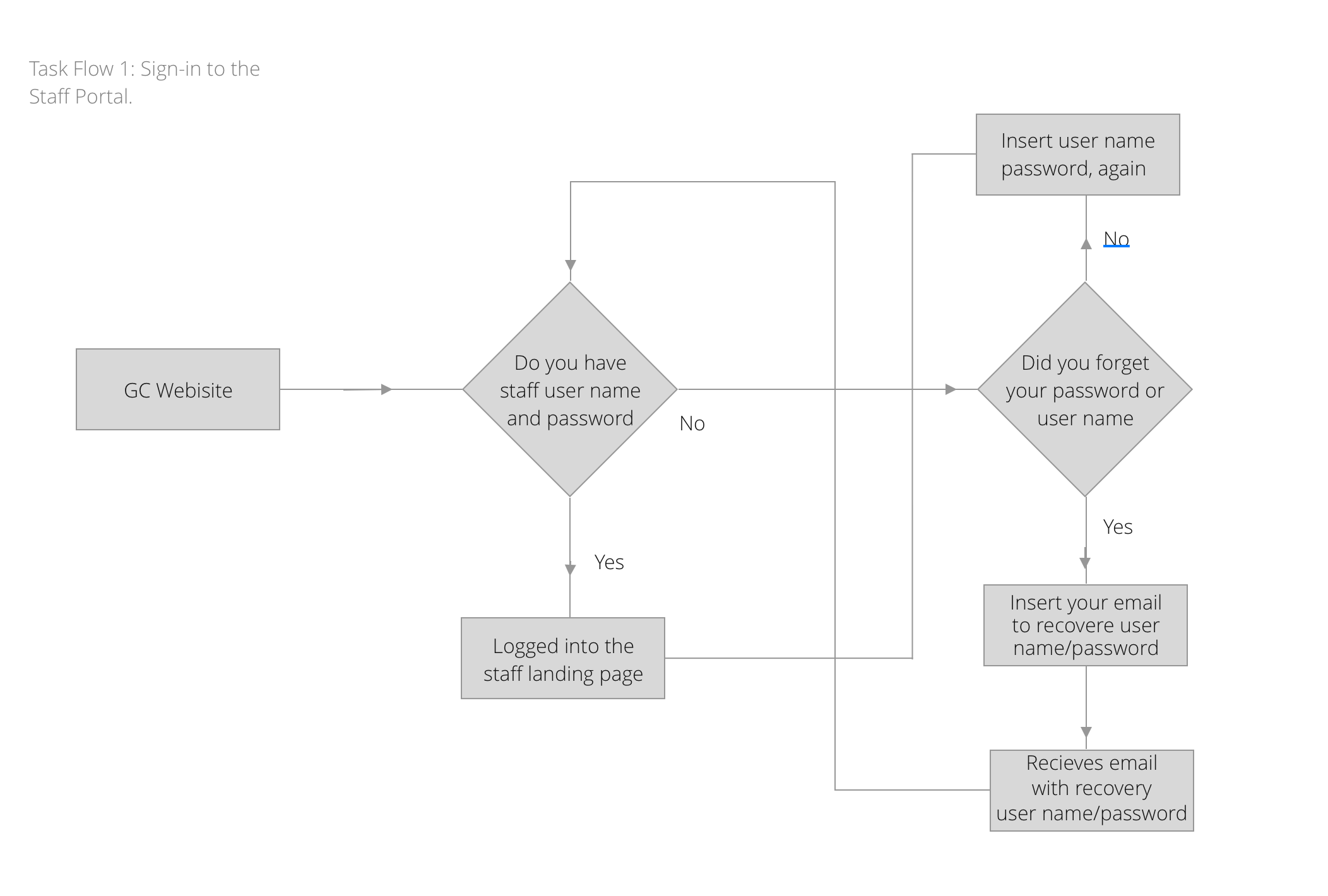
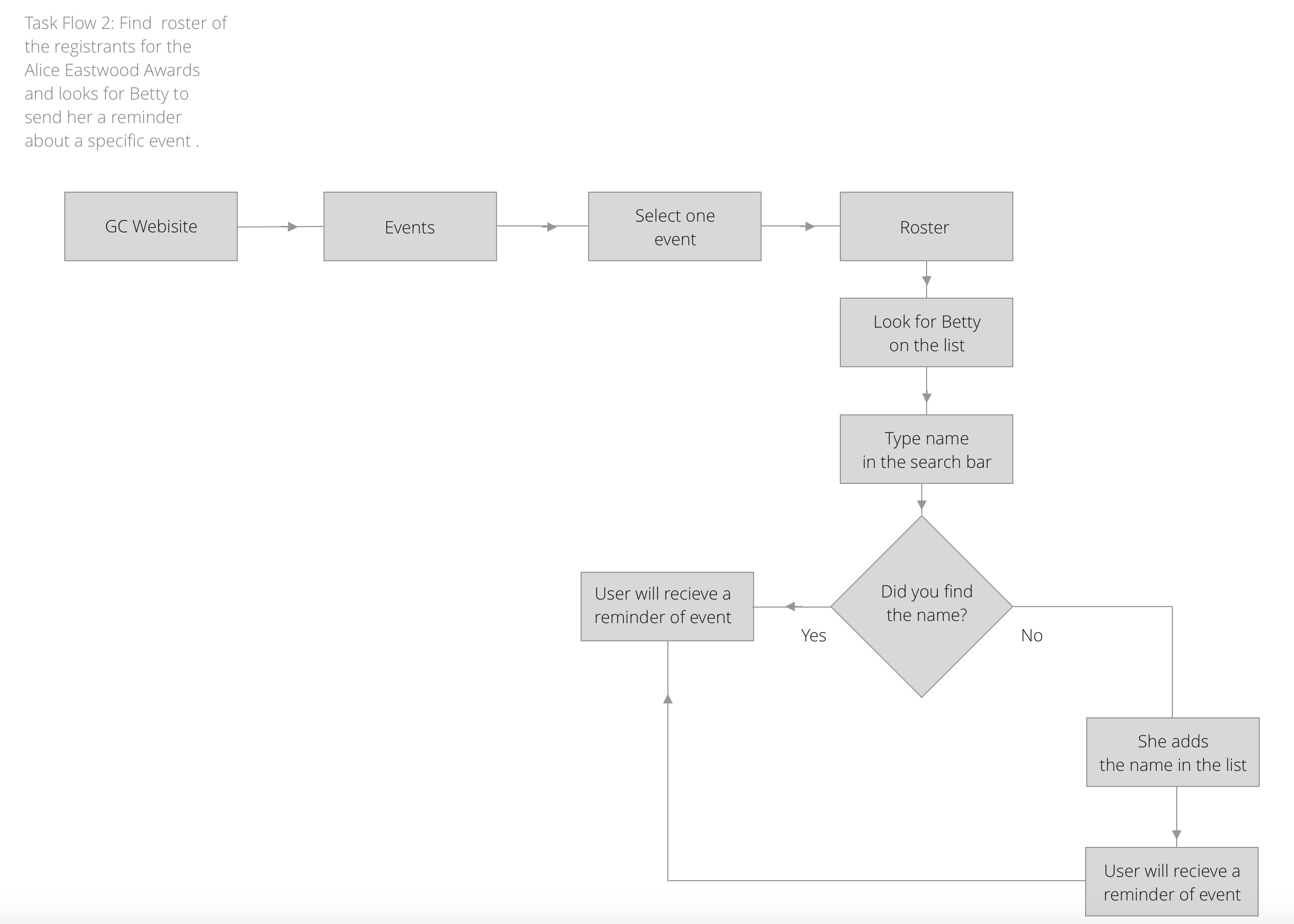
Task Flow
We defined some critical tasks the users need to do on the new website.
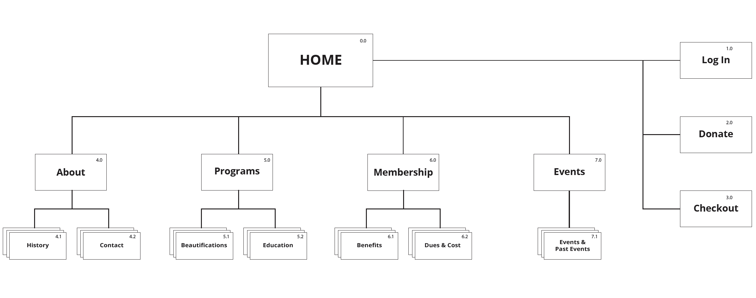
Site Map
Wireframes
We started sketching some pages to visualize the design.
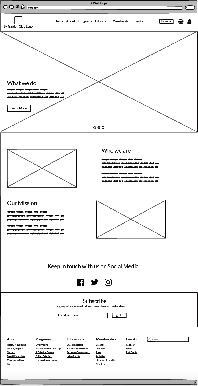
Home
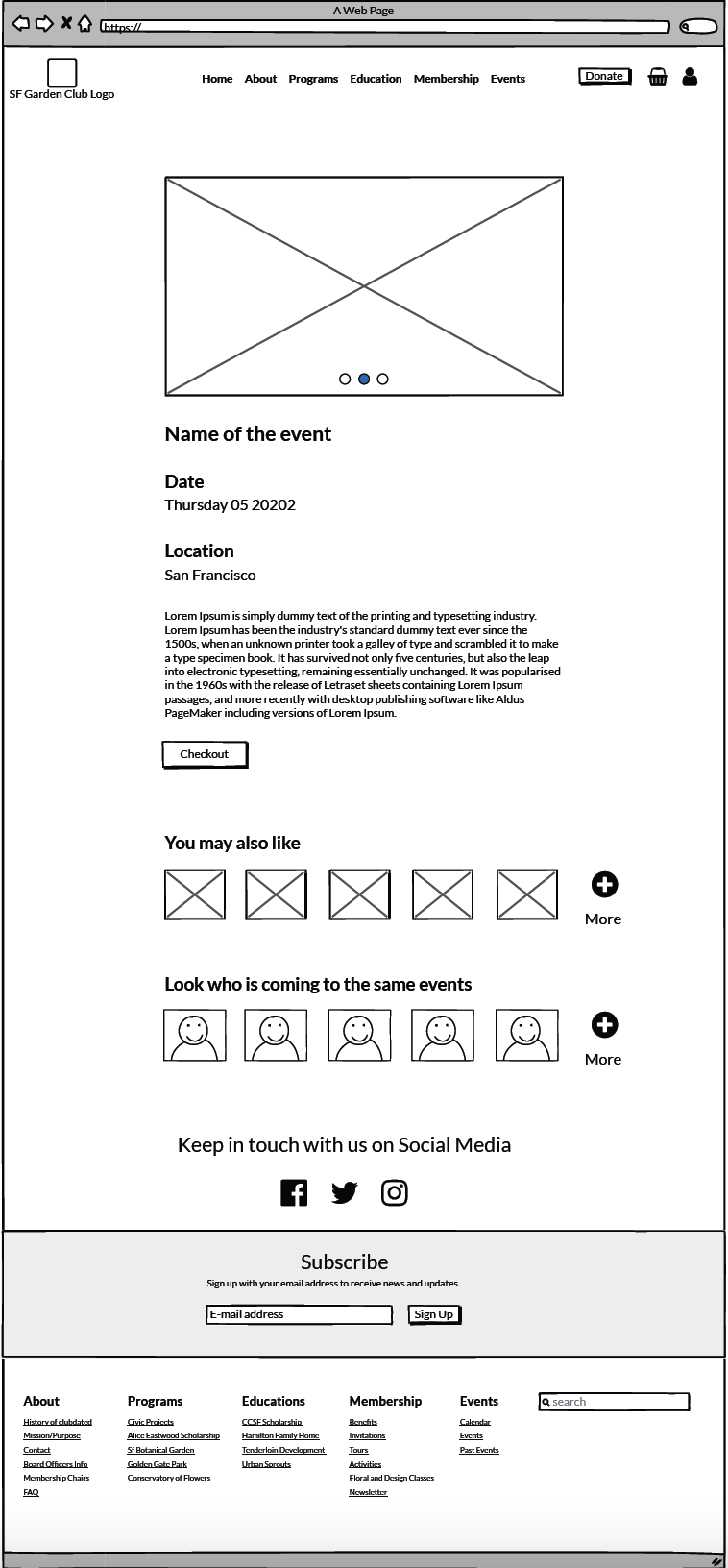
Event Details
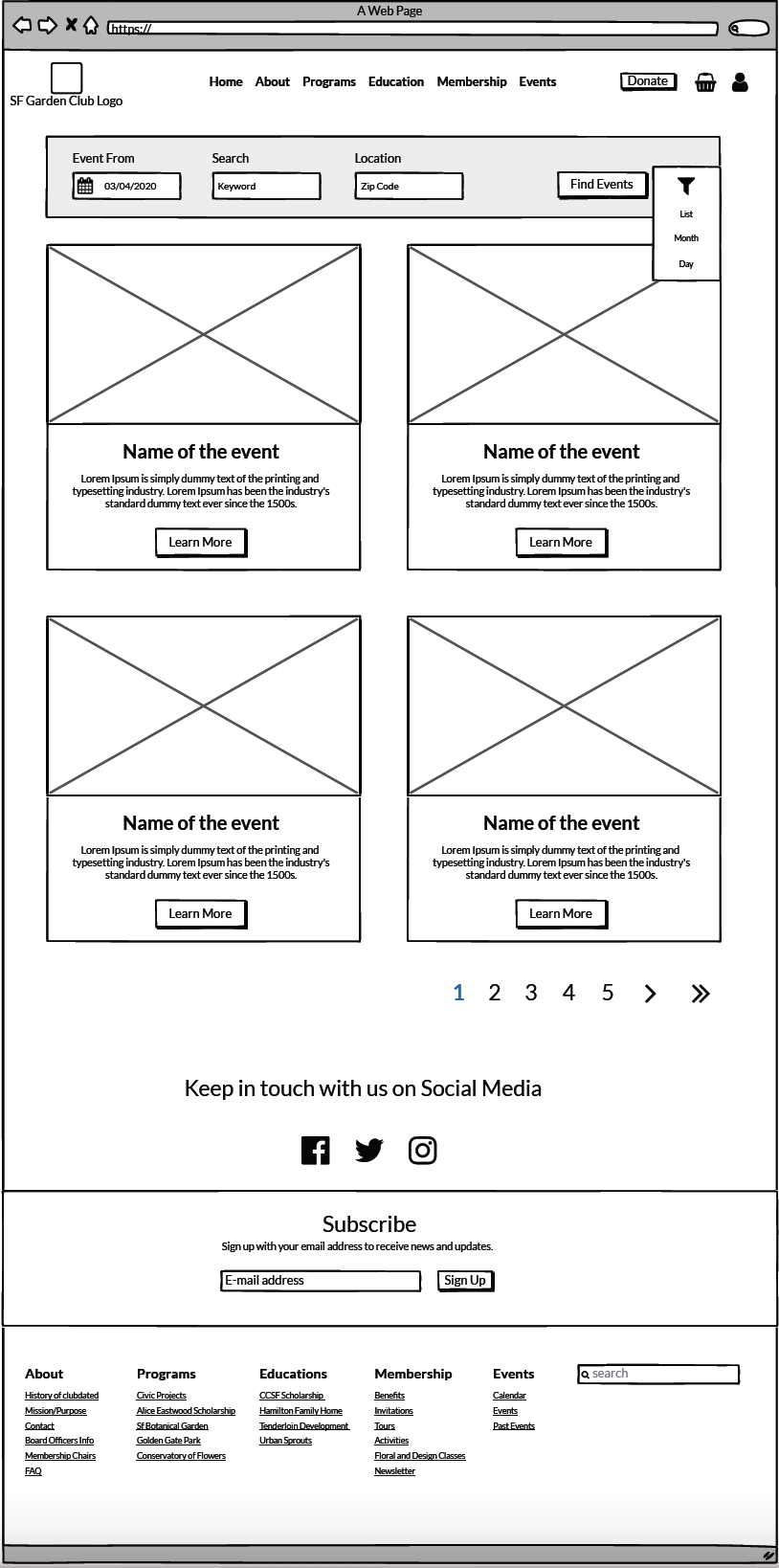
Event
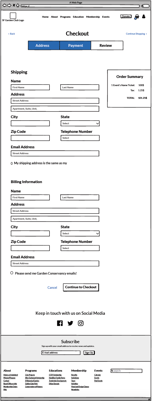
Checkout
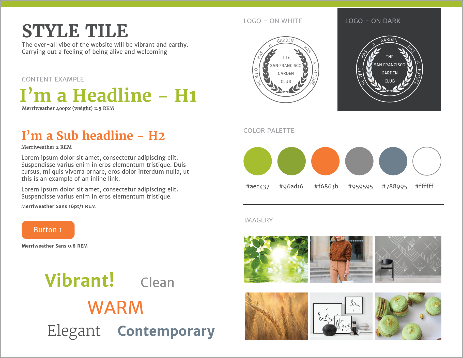
Style Tile
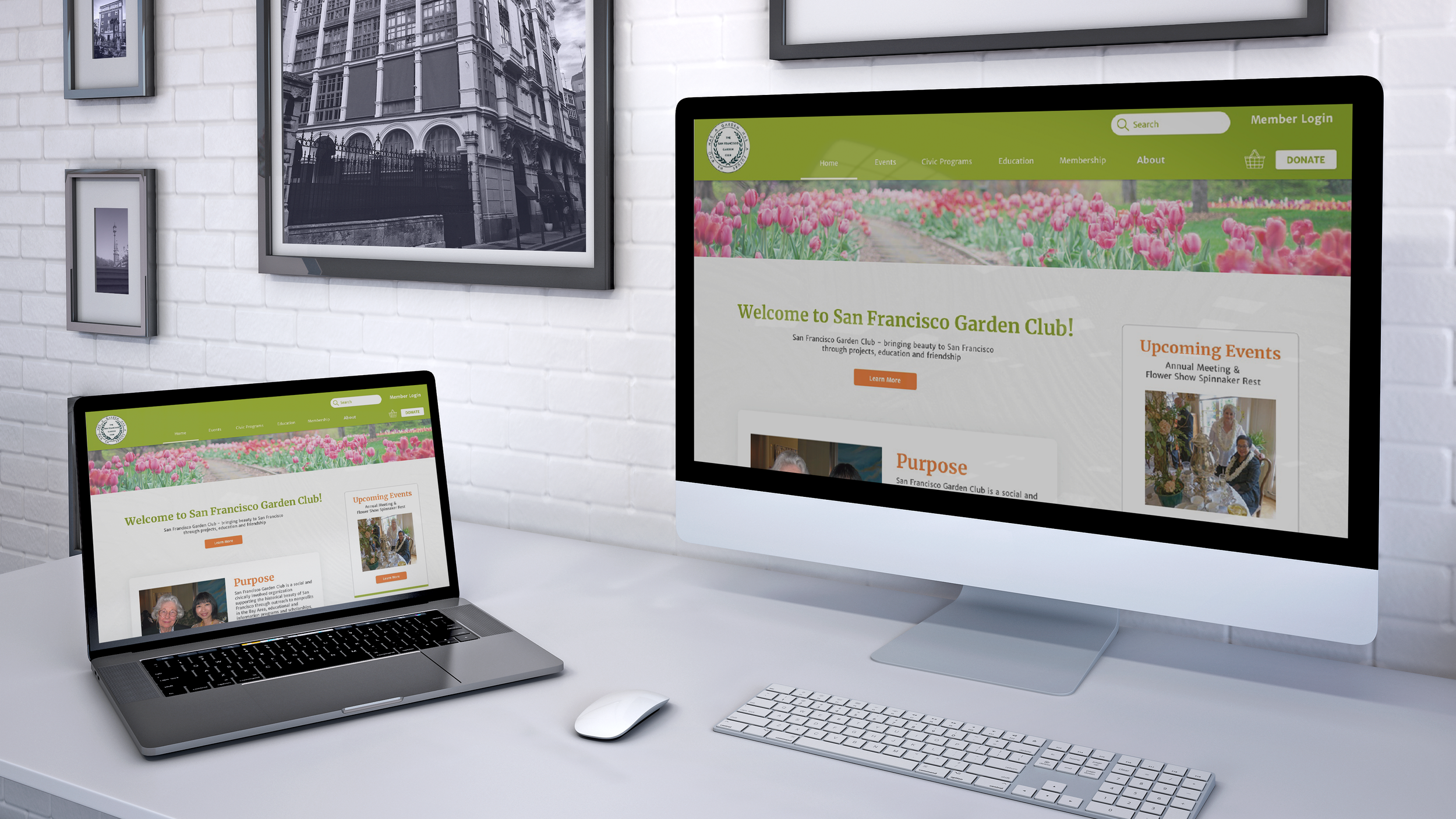
Mockup
What changed?
The features I improved are the followings:
Upcoming Event Shown in the Home Page
Differentiate the donations forms
Added Board Page
Added a Gazette Page and Integrated it in the Home Page
The features to add to the existing product are the followings:
New Membership-Only Area
Possibility to buy and reserve an event
Added Newsletter
Added Testimonials
What I learned
This was my first project UX/UI design project with a real customer. Here are just some of the lessons I learned:
Test, test, and test!
Never hesitate to test the products even though the process seems to be completed. There is always room for improvement.
Never forget about your target audience.
By redesigning the architecture information based on the research result, the website results easier to navigate.
Make clear and visible what the user wants to see.
After studying the user research results, It was clear what to improve and what to remove.
You can visit the San Francisco Garden Club here .