Fitness SF App
I redesigned and rethought most of the relevant areas of the mobile application ⏤ class schedules and class reservations. Once I understood the current problem and analyzed our users’ behaviors, I ran the initial explorative research with the Fitness SF users through a survey, 1:1 interviews, and creative brainstorms. I started wireframing with the learnings, reestablished architecture information, and finally created the final prototype after several testing versions of it.
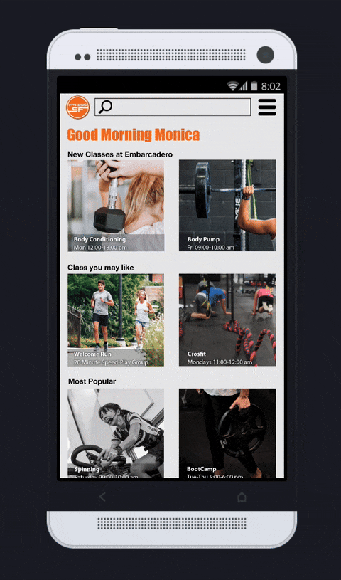
Before
After
Problem Statement
What problem are we trying to solve?
How do we know this is a real problem?
Why is it important to solve?
Who are our users? What are their goals and motivations?
How will we know if we’ve solved the problem?
San Francisco is a pioneer in the world of health and wellness, and the city is surrounded by some of the country’s best gym where you can find any different workout classes and body activities. It provides nine different locations in which all members can have different fitness experience.
To reach all members and give them all the information about class schedules, class changes, and membership, they created an App to access what the members need quickly.
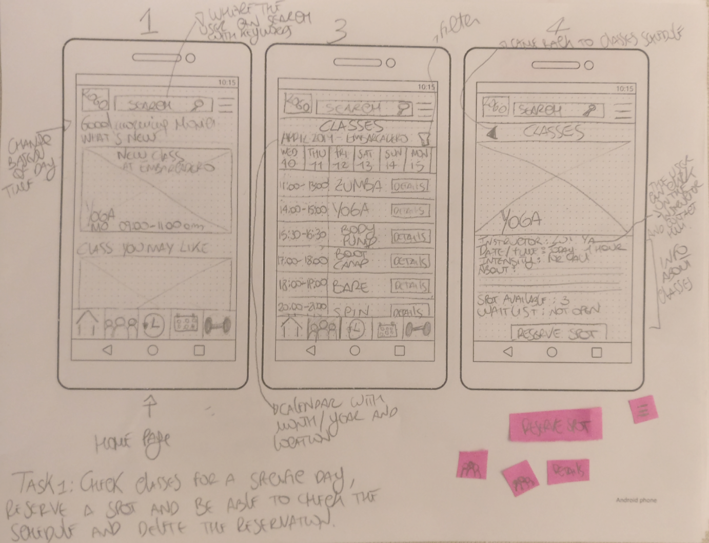
Unfortunately, the app needs to be improved in some aspects. Check the class schedule with the app requiring time and effort from the user since the member has to select the gym’s location before seeing the class information. Moreover, if the user wants to have a list of the course he wants to join, there is no way to see his schedule and plan the classes he wants to enter each week. There is no way to reserve a spot for the classes since they are all walk-in, but in this way, especially in the afternoon classes, there is a possibility to find the class full and crowded. Reserving the spot in advance, let the instructor know how many people will be in his class and avoid that the clients will find a full course and renounce to the class. The Fitness Sf is a vast community, and each member wants to feel part of it. It isn’t very easy to contact the instructor and staff through the app, and the user has to email to generic contact service. It is important that the members can reach the instructor and send him any feedback and concern about the course. It needs a new app that will give the user the ability to check the class schedule, reserve a spot, and connect him to the instructor in an efficient and fast way.
Research

The survey's goal is to gather information from the members about the usage of the gym app. I created about 20 questions, including some multiple choice and open inquiry, which were taken by about 21 Fitness SF members and instructor. The primary goal of the survey is the overall understanding of the followings aspects:
Understand what kind of features of the product could be improved to produce a better daily usage of the app form the user
Investigate what kind of features is missing in the product
Identify what kind of frustrations the user has to deal with to complete the task
Know what is the overall opinion about the product
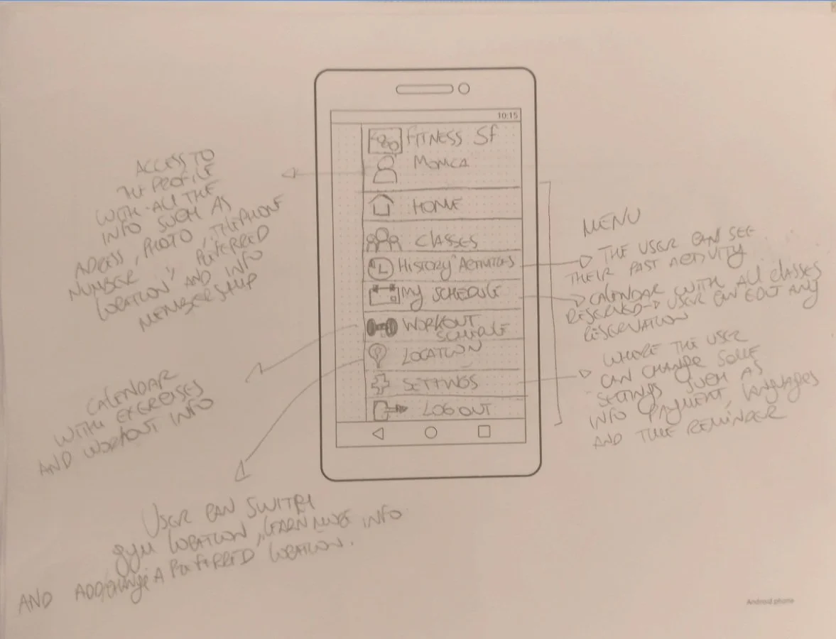
Wireframes
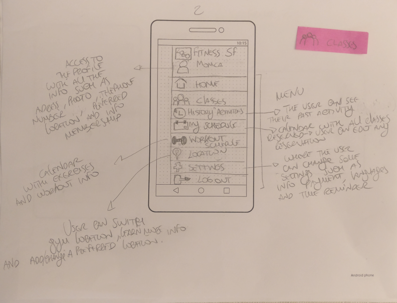
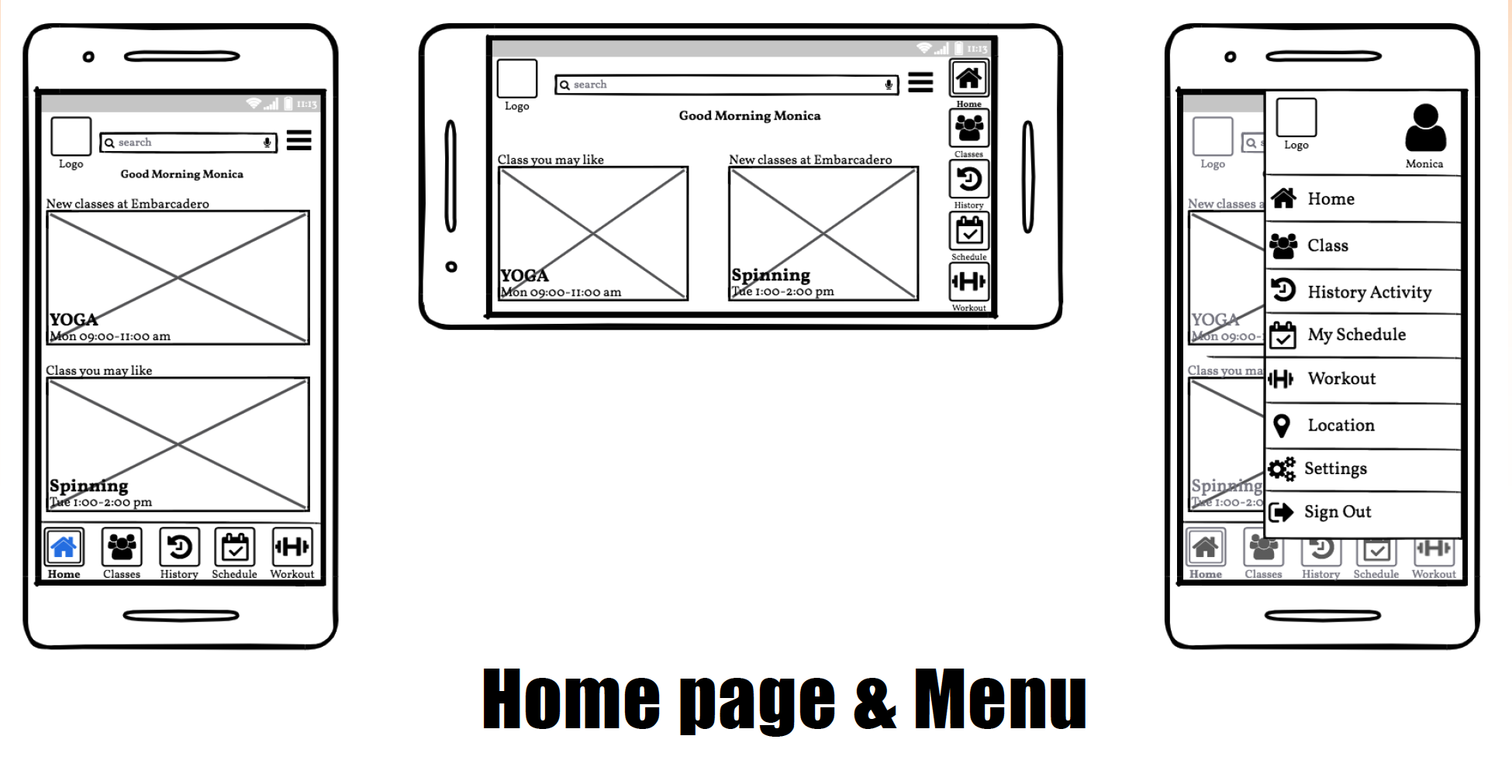
I wireframed a new flow by starting from the homepage. I went for a solution that puts what was most important for our clients when opening the app.
Paper Wireframes
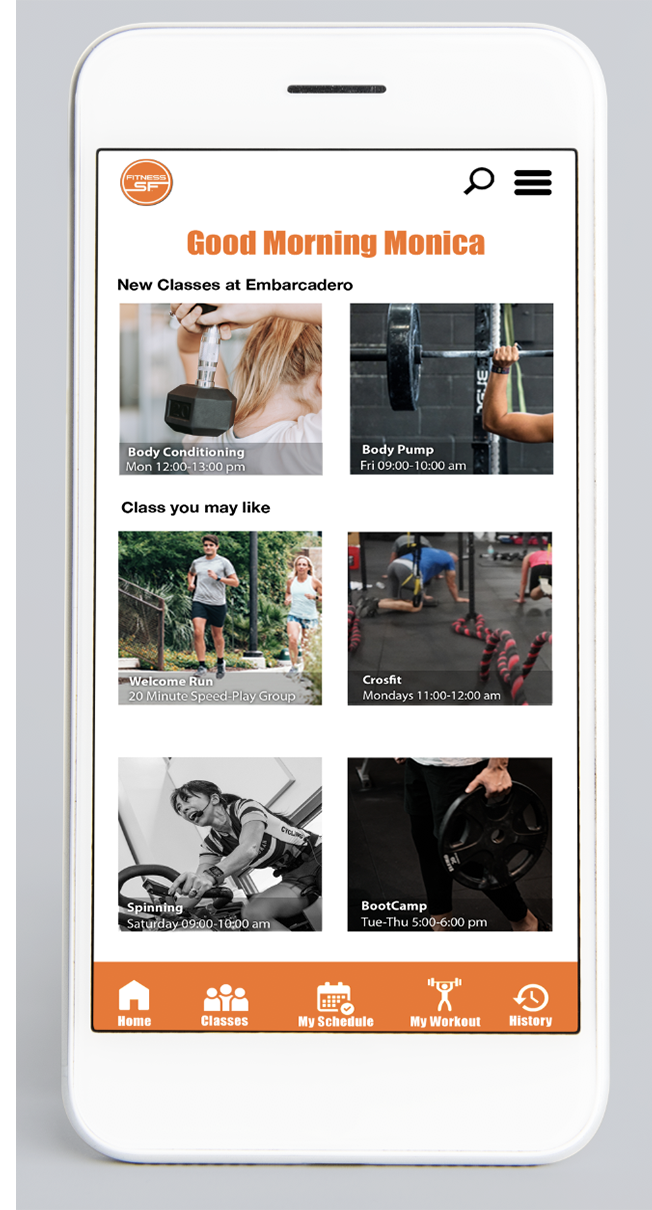
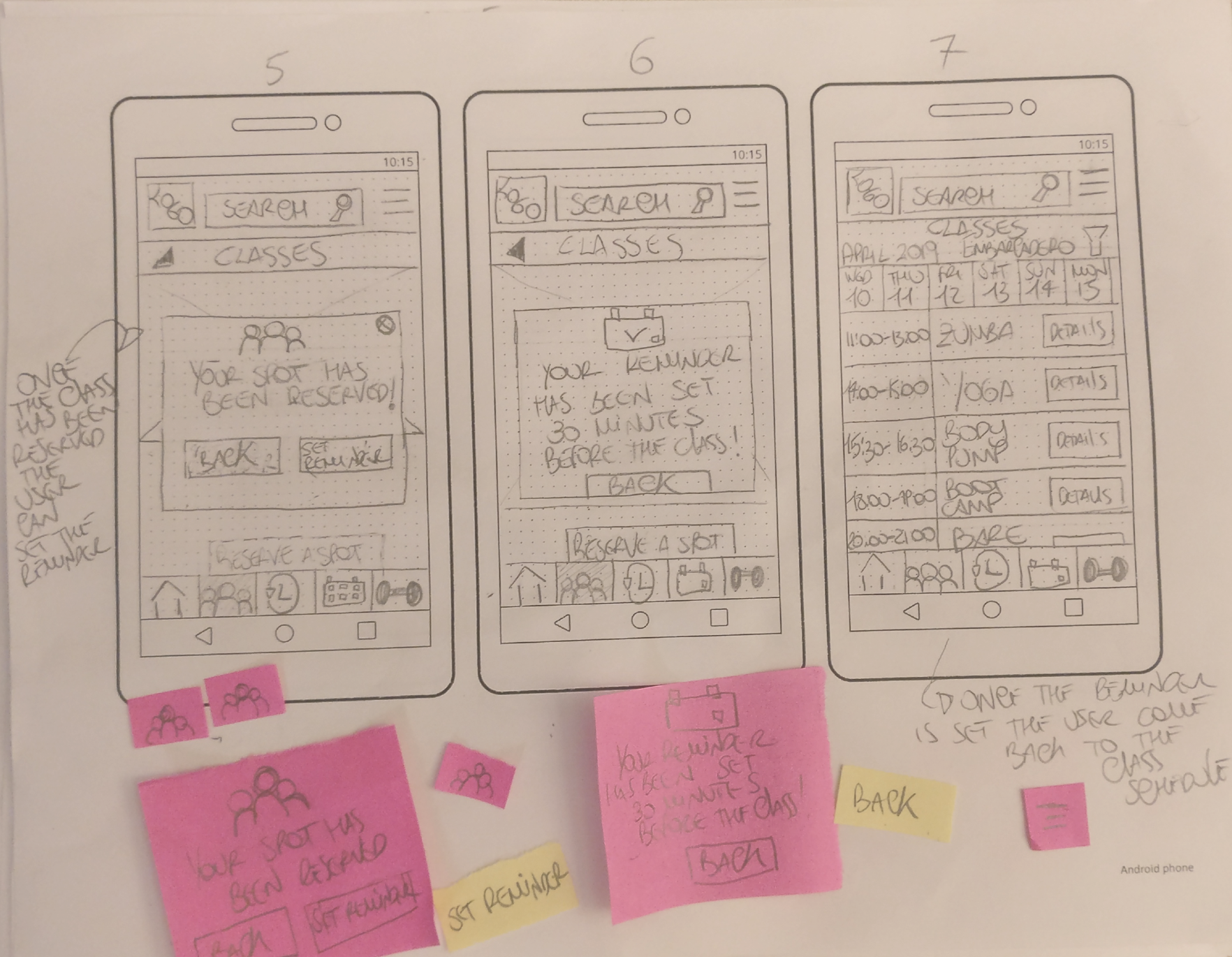
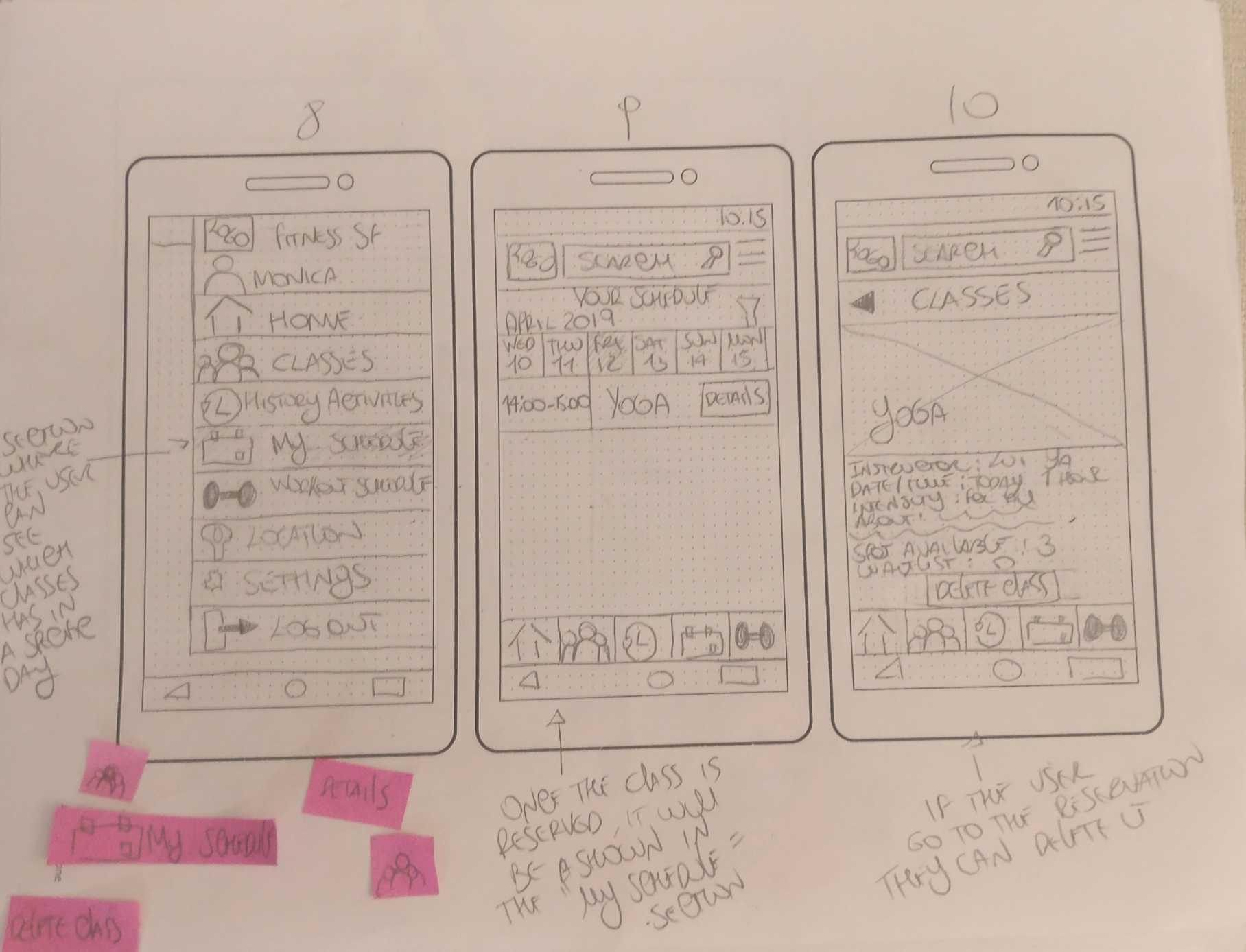
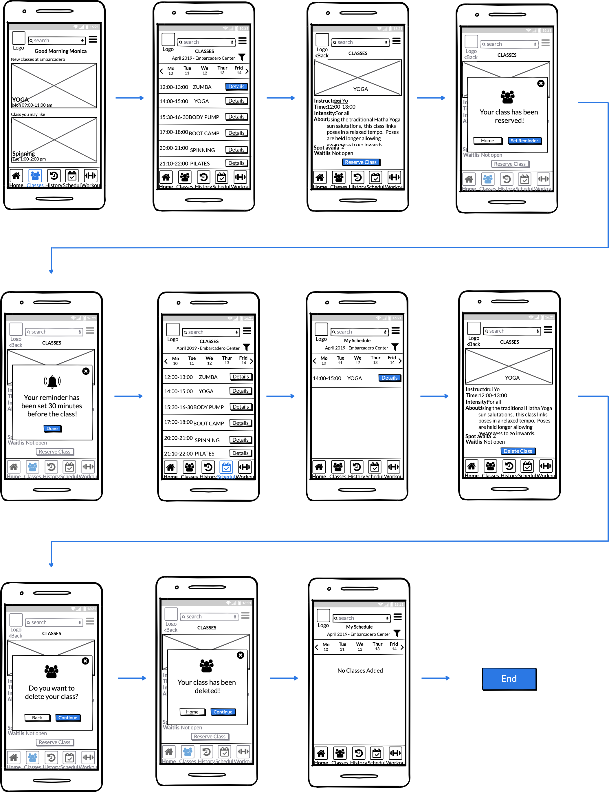
Once the user is already logged in can search the class of the day and when he/she finds what she/he wants, can also reserve a spot and finally be able to set a reminder 30 minutes before the class starts.
Task 1

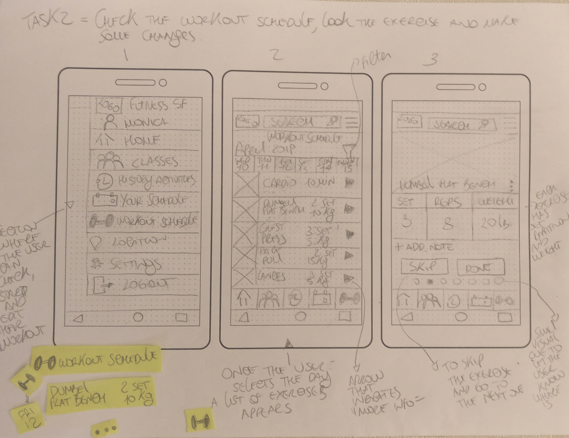
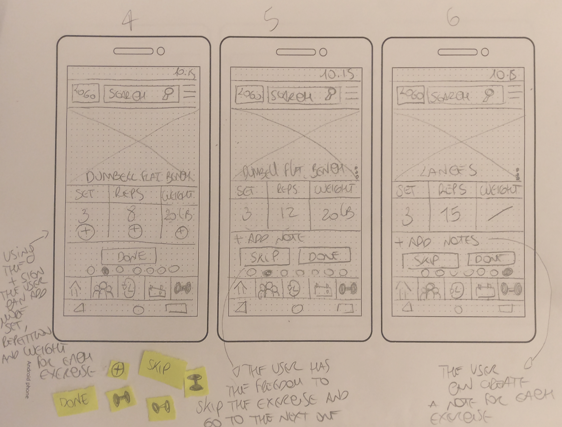
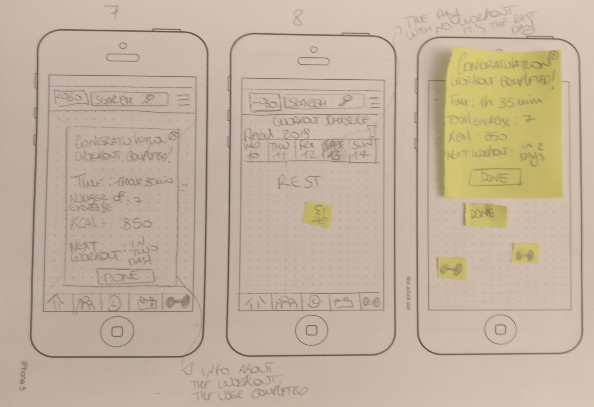
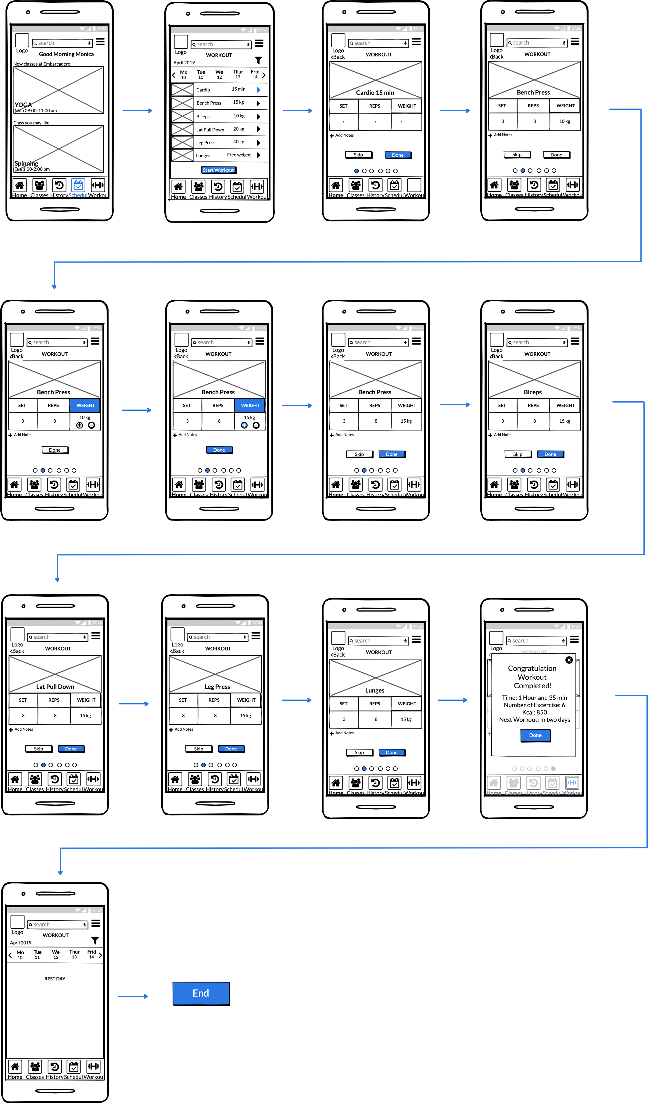
Once the user is already logged in can search the workout of the day to do at the gym. He/she can check the calendar and look at what kind of exercise has to do. Once he/she started the workout, he/she can able to edit the activity individually.
Task 2
Digital Wireframe
Task 1
Task 2
Visual Interaction
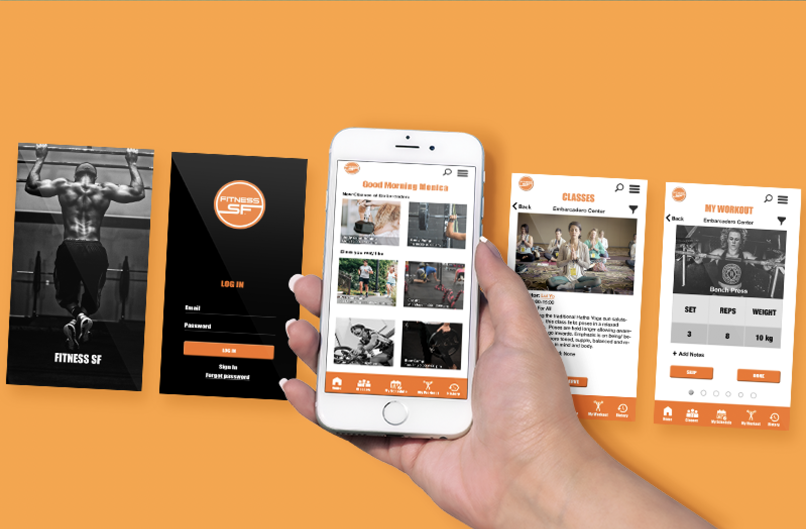
Once the wireframes were completed, I moved to visual design. After designing various options, I ran a few usability tests to understand which one would have been more attractive to users. Thanks to a series of design reviews that followed, I was able to propose an ideal version of the new home page, the class schedule and workout pages.

Prototype
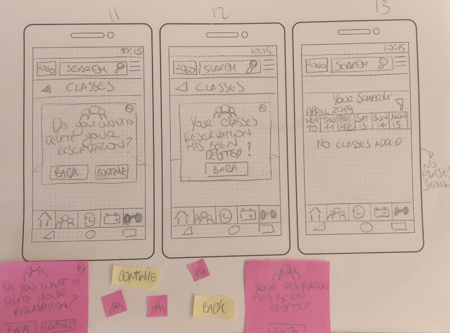
I created two prototypes to test two individual tasks for the Fitness SF App. I opened the prototype from my telephone, and I tested it with five users, with different habits, technical skills, and interests. I explained to them how important it was that during the testing, the user has to speak loud and let me observe them without helping them in the task. Moreover, I often highlighted anything could be wrong in the user action. The intent of the User Testing is not judging but improve even more the experience through the app. The first task I tested was searching, finding a reserve a spot in the Yoga class, and deleting the reservation. The user had to navigate two different sections and grasp some of the product's features. Finished the first task, I asked the user to accomplish the second and final test. I asked the user to pretend to want to work out at the gym using the exercises schedule present in the app, starting the workout and modify the weight of one the exercise.
Task 1
Task 2
What changed?
The features I improved are the followings:
Class schedule layout and content
Preferred location easy to find and use
Functional reminder
The features to add to the existing product are the followings:
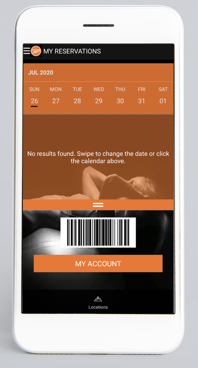
Reservation of the classes
History activities
Workout schedule
What I learned?
This was my first project UX/UI design project. Here are just some of the lessons I learned:
Test, test, and test!
Never hesitate to test the products even though the process seems to be completed. There is always room for improvement.The app is created for tasks, not for the info!
By removing all the not relevant information, the user's navigation will be easy, enjoyable, and smooth.Make clear and visible what the user wants to see.
After studying the user research results, It was clear what to improve and what to remove.